
"How to make your pictures look like film" is one of the trending editing techniques these days. A lot of photographers will say "You should just use real film". But the reality is that film photography can become quickly really expensive, as a lot of good quality film rolls are very pricey, and not every photographer has access to either a dark room, or a reliable photography lab for the processing of their pictures. Whereas every digital photographer has access to a computer, right?
In my opinion, film gives a very special dimension to pictures: film photography tells a different story, as if every picture was a memory in itself. And it sometimes allows you to be more careful about details and more considerate about the composition of the scenes you're capturing.
I deeply love film and the creative range it allows. But when I travel, I find that bringing my film cameras can be too impractical. However, if you're like me and still wish to achieve the film look, there are some basic tips you can apply to edit your digital pictures to make them look like film. These tips are made for Adobe Lightroom, but they can work with other photo editing software with the same editing functionalities.
1. Editing colors: color grading and color correction
Let's start with some basic things that distinguish digital and film pictures. To put it (very) simply: digital cameras use a sensor, with millions of pixels collecting light to create images, while film is a thin stripe of plastic (or other material) sensitive to light and used to capture images through chemical processes. The number of pixels determines the resolution of the digital picture. Since it uses chemical processes that don't split pixels in such a linear way as digital photography, film captures higher-resolution images. Because of this, it is often said that film blends colors better. And, let's be honest, nothing quite compares to the color consistency of film.
What's really special about film rolls is how colors are represented differently from one film to another. Whether it's Fujifilm Velvia, Kodak Ektar or Lomography LomoChrome, the tone, contrast and saturation of the colors are always going to be different.
There are two types of color editing: color correction and color grading. Color correction refers to the process of correcting the white balance, exposure, contrast, saturation and vibrance of your image. Color grading refers to editing the hue, saturation and brightness of the shadows, middle tones and highlights of your image. Basically, color correction ensures you start with natural-looking colors before proceeding to edit with your desired style. This style can be obtained through color grading.
Color correction
I will not spend too long on color correction, as it is entirely dependent on the settings of your digital camera and the light at the moment when you took your picture. I adjust my white balance and saturation to make sure the colors are as close as the original scene, before I start the rest of the editing process.
Color grading
Color grading is where you start to have more fun, because it allows you to express specific styles. To achieve a film look, I like to first lower my saturation a little, and lift the vibrance a little bit. Keep in mind that there is not one general film look, but that it depends on the style you want to achieve. It is entirely up to you! You can color grade using the HSL adjustment panel in Lightroom, as well as the grading panel.
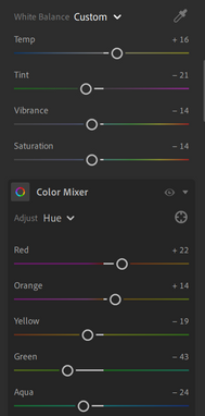
I chose to give my pictures a more greenish/yellow look. For this, you can bring your white balance up, towards a warmer tone, and the tint slider down, towards a green hue.


Then, adjust the HSL settings: bring down the saturation of the most dominant colors in your image to mute them. As for the hue, I like to bring the indigo, green and yellow hues slightly down, and to lift the red and orange hues. Then, through the grading panel, I adjust the shadows to give them a greener tint, the middle tones to give them a more turquoise tint, as well as the highlights to give them a more yellow/orange tint.


2. Editing light and contrast
Some photographers chose to edit light and contrast first (as it is also a part of color correction), and I do too for most of my digital pictures. However, when I edit like film, I prefer to edit these settings after color grading.
To give a more "muted" look to the pictures, you can lower your contrast, as well as lift the shadows and blacks. I also like to lower the highlights, so the image will have a softer look. You can adjust the exposure how you like it, depending if you prefer a darker or a lighter picture.


3. Adding grain to the picture for a look closer to film
A specific thing about film is how grain is noticeable in the pictures. Film grain results from the tiny silver crystal particles used in the chemical processes allowing pictures to be captured on film. The size of the grain depends on the film's ISO (the sensitivity to light): the higher the ISO, the higher the sensitivity and the bigger the grain. Accordingly, when there is a lot of grain in a picture, there is no blur: it's something to keep in mind when you wish to achieve a film look through your editing process.


In Lightroom, you can adjust the grain quantity and size on your picture in the "Effects" settings: I like to lift both sliders up, to make grain more apparent. I like to also bring the clarity slider down, and add the slightest bit of vignette.

4. Telling a story
I think that one of the most important things when you wish to make your pictures look like film, is to keep in mind that one of the purposes of film is to carefully choose what you capture. Because a film roll is usually made of 36 shots, I don't simply edit all of my pictures from a trip, a photoshoot or a specific event with a film look. I select about 20 shots, and with them, I try to tell a story. My last advice is therefore to not edit just to edit, but rather with the intention of making your images carry something: a feeling, a memory, a story... it's up to you!

Disclaimer: The picture I chose is just one example of editing, and the same settings may not work on every picture. This is just a general direction, and it's up to you to make it work for your own pictures!
Comments